SimplePractice Calendar: Custom Color Tagging for Appointments and Events
California, United States
2025
Led the design and implemention of a custom color-tagging feature for the events flyout in the SimplePractice calendar, improving event categorization and user clarity.
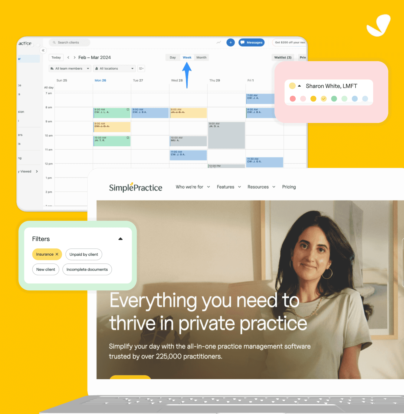
The SimplePractice Calendar is used by therapists, clinicians, and wellness professionals to schedule, manage, and track client appointments, all in one place within their EHR platform, accessible on both web and mobile.
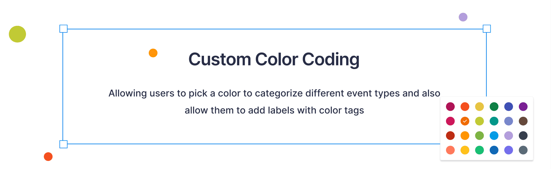
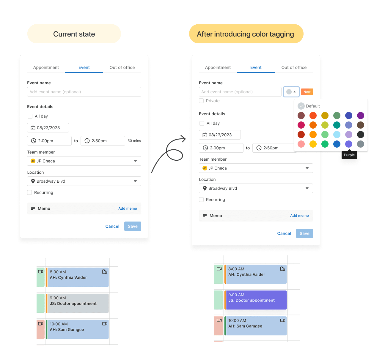
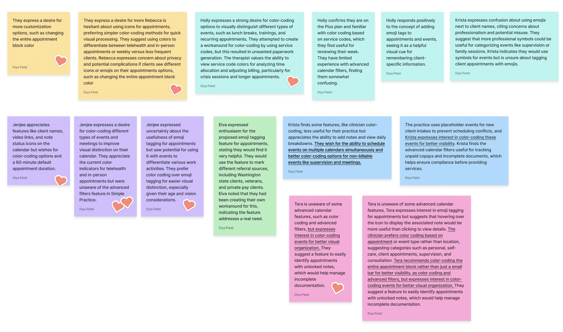
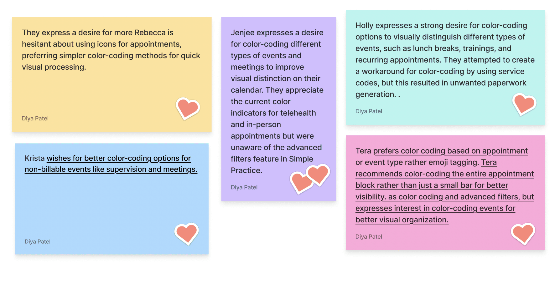
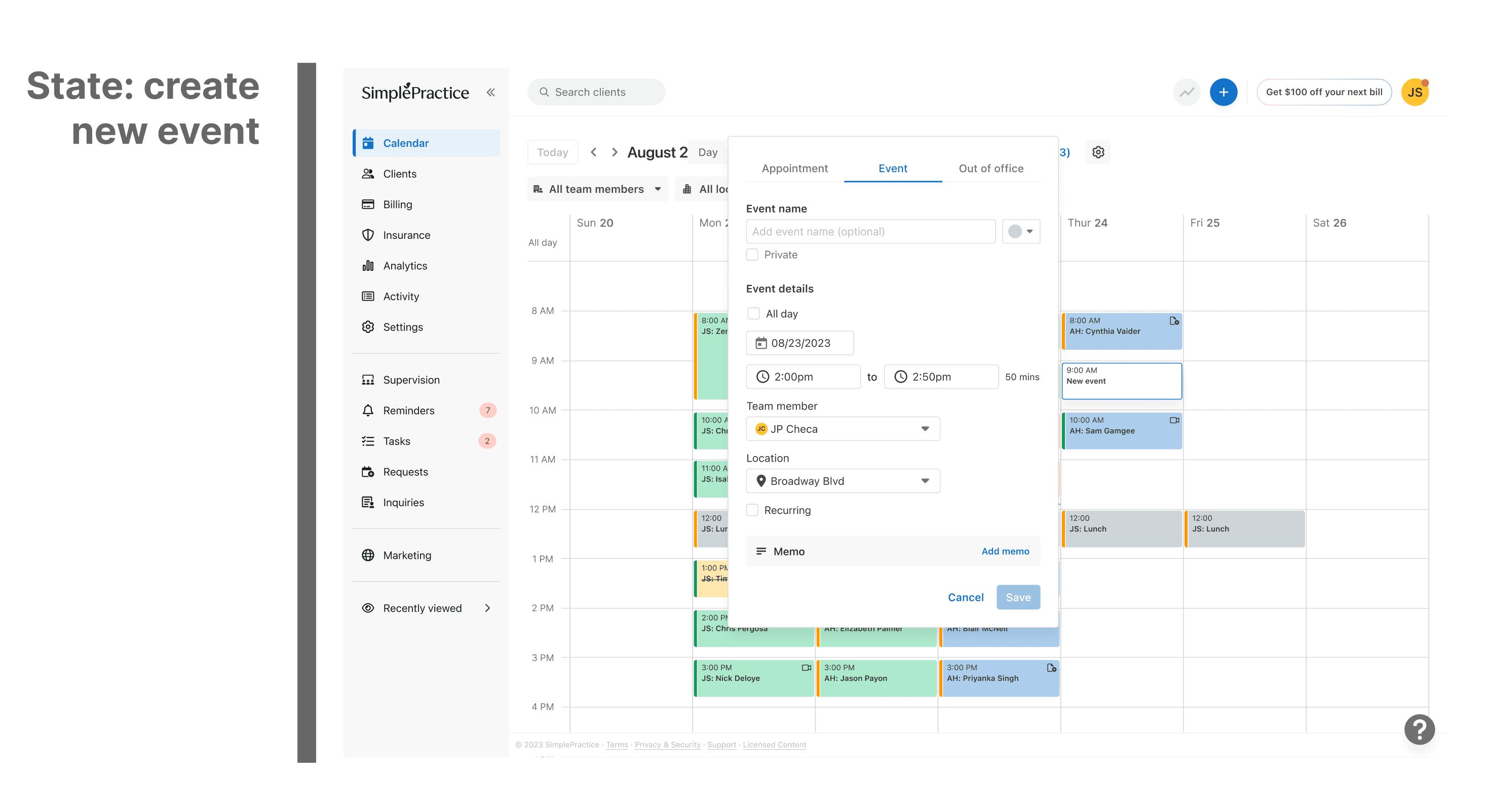
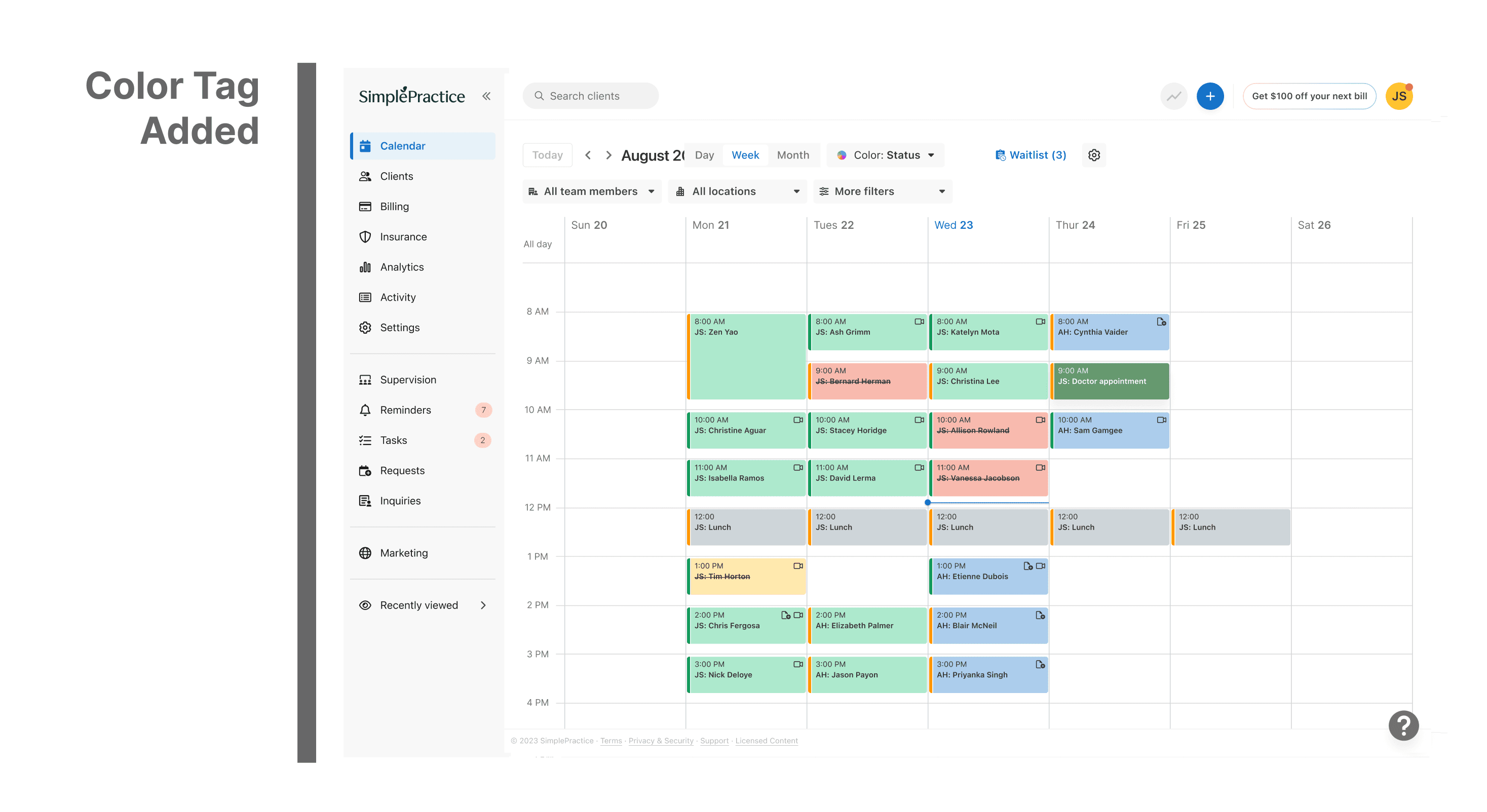
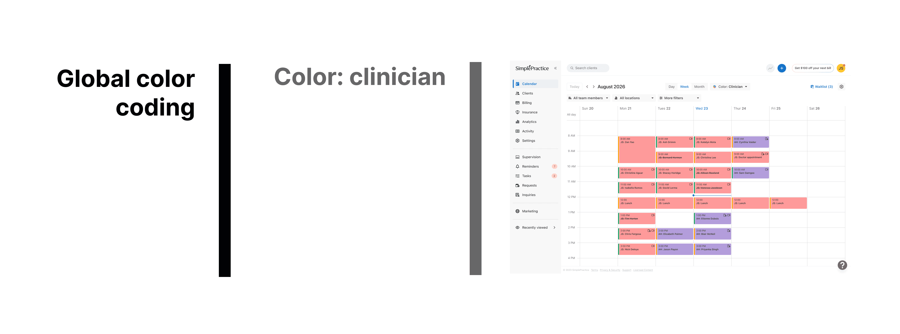
Originally, all events in the calendar appeared in a uniform grey color, regardless of type or purpose. While functional, this design made it hard for users to quickly distinguish between sessions, personal events, cancellations, or reminders, especially when managing packed schedules.
Users often mentioned that the calendar felt “monotone” and “visually heavy,” forcing them to rely on text instead of quick color cues.
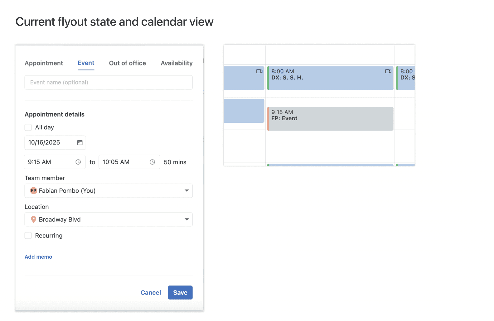
Making the calendar visually intuitive by enabling users to categorize and identify event types at a glance reducing cognitive load and improving scheduling efficiency.
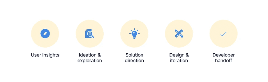
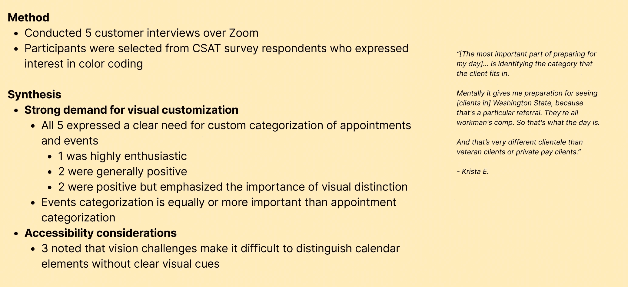
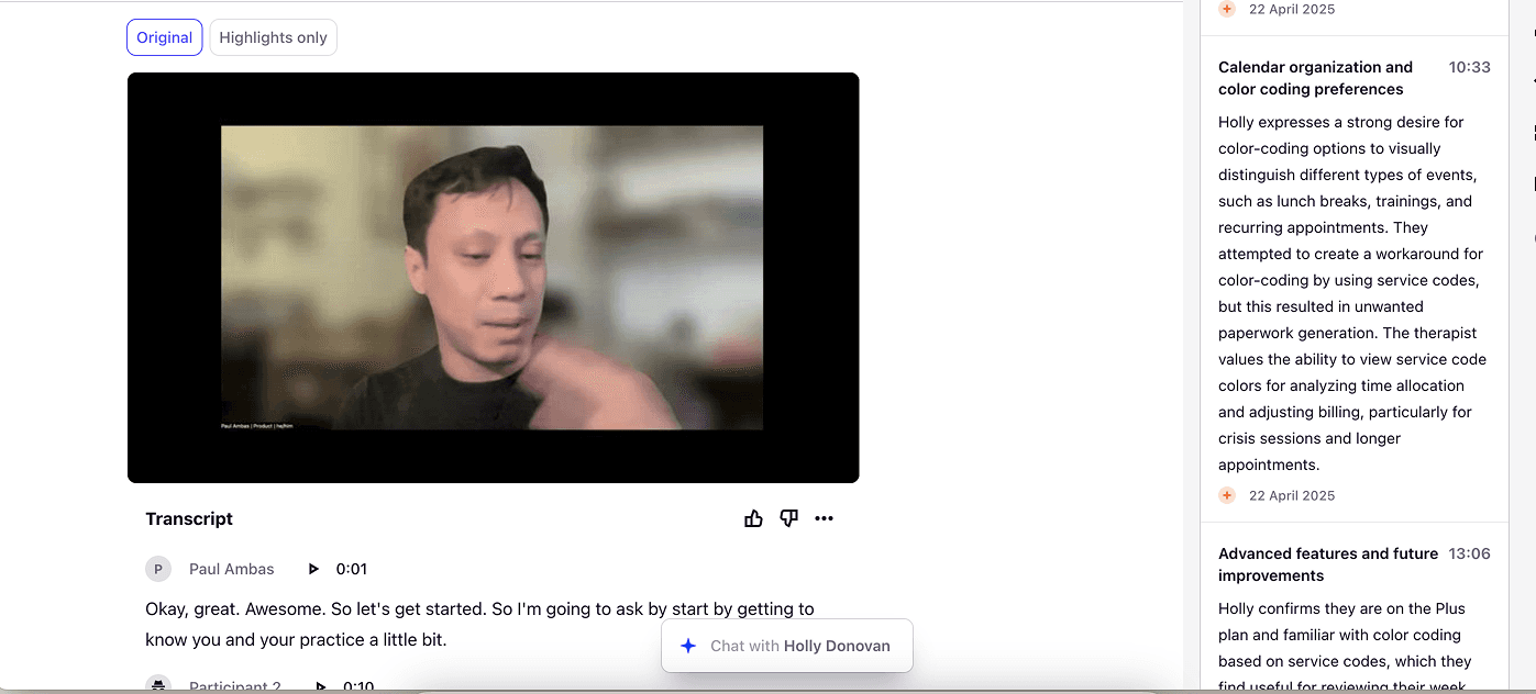
User insights - Reviewed user feedback and customer support reports highlighting confusion with event differentiation.
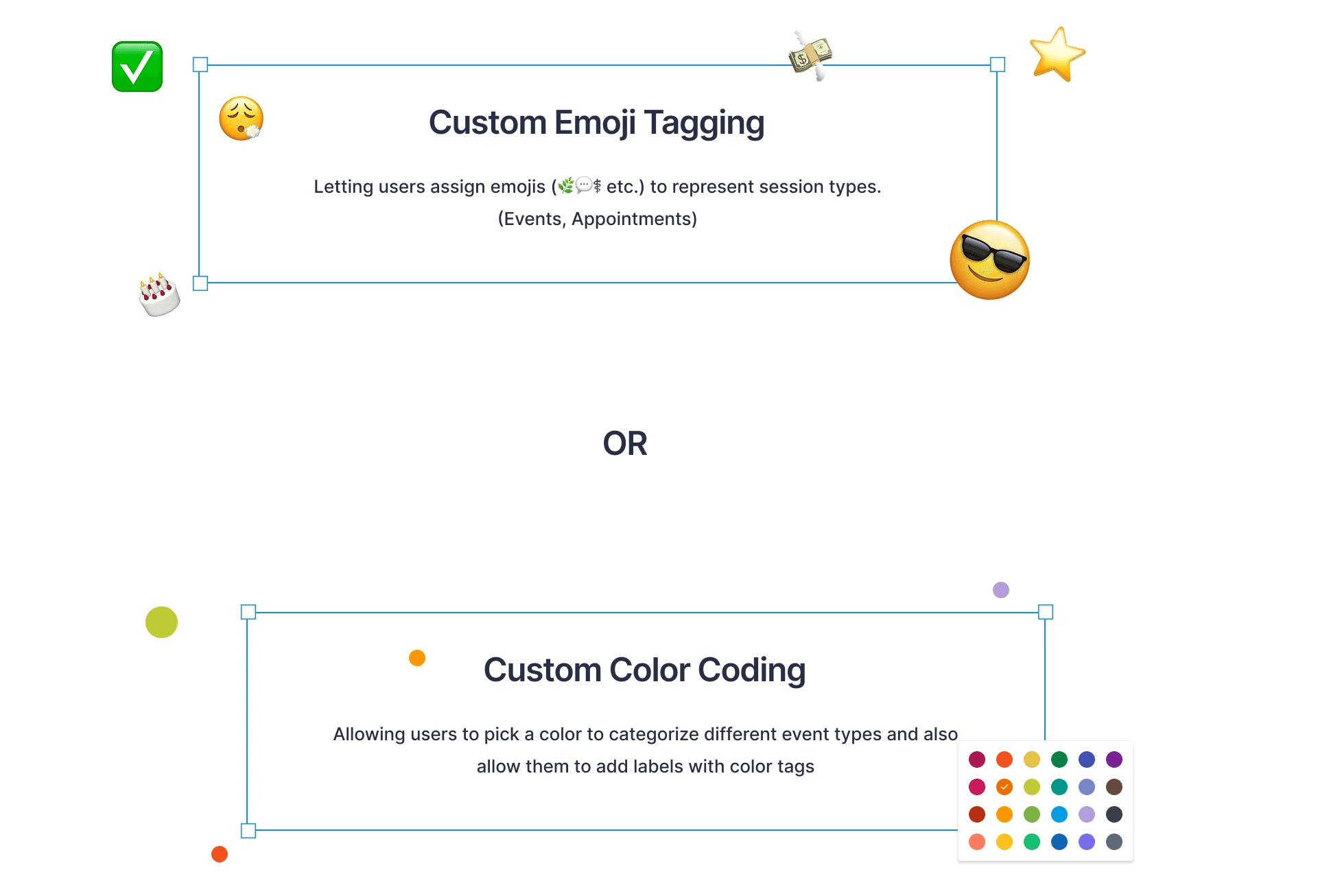
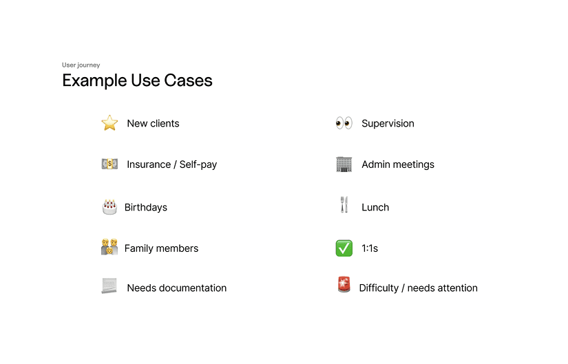
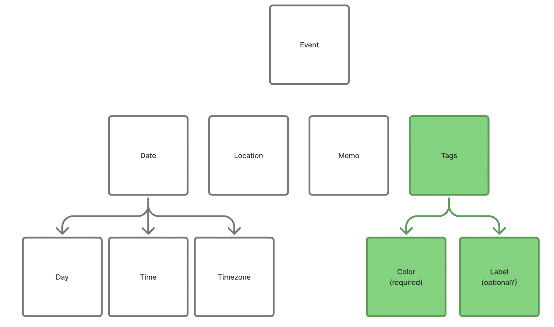
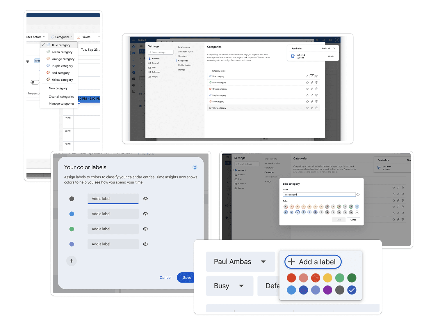
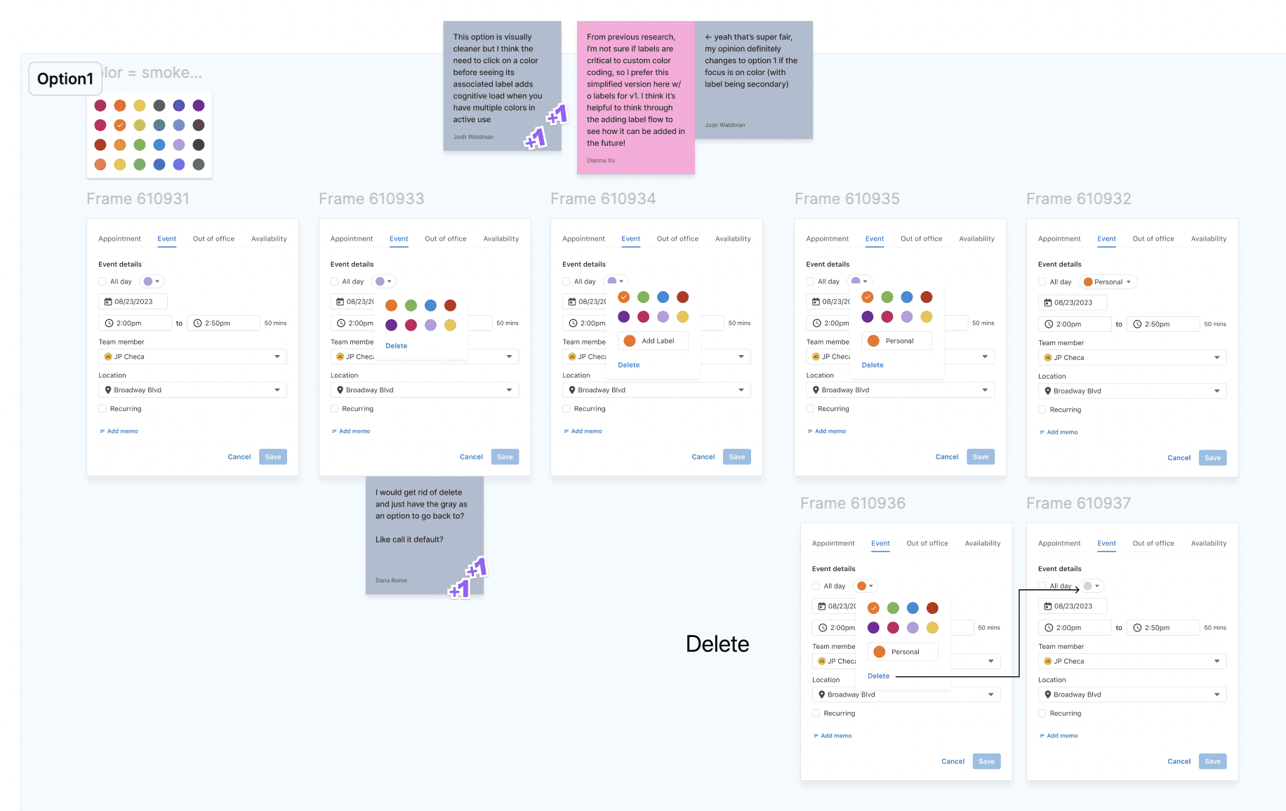
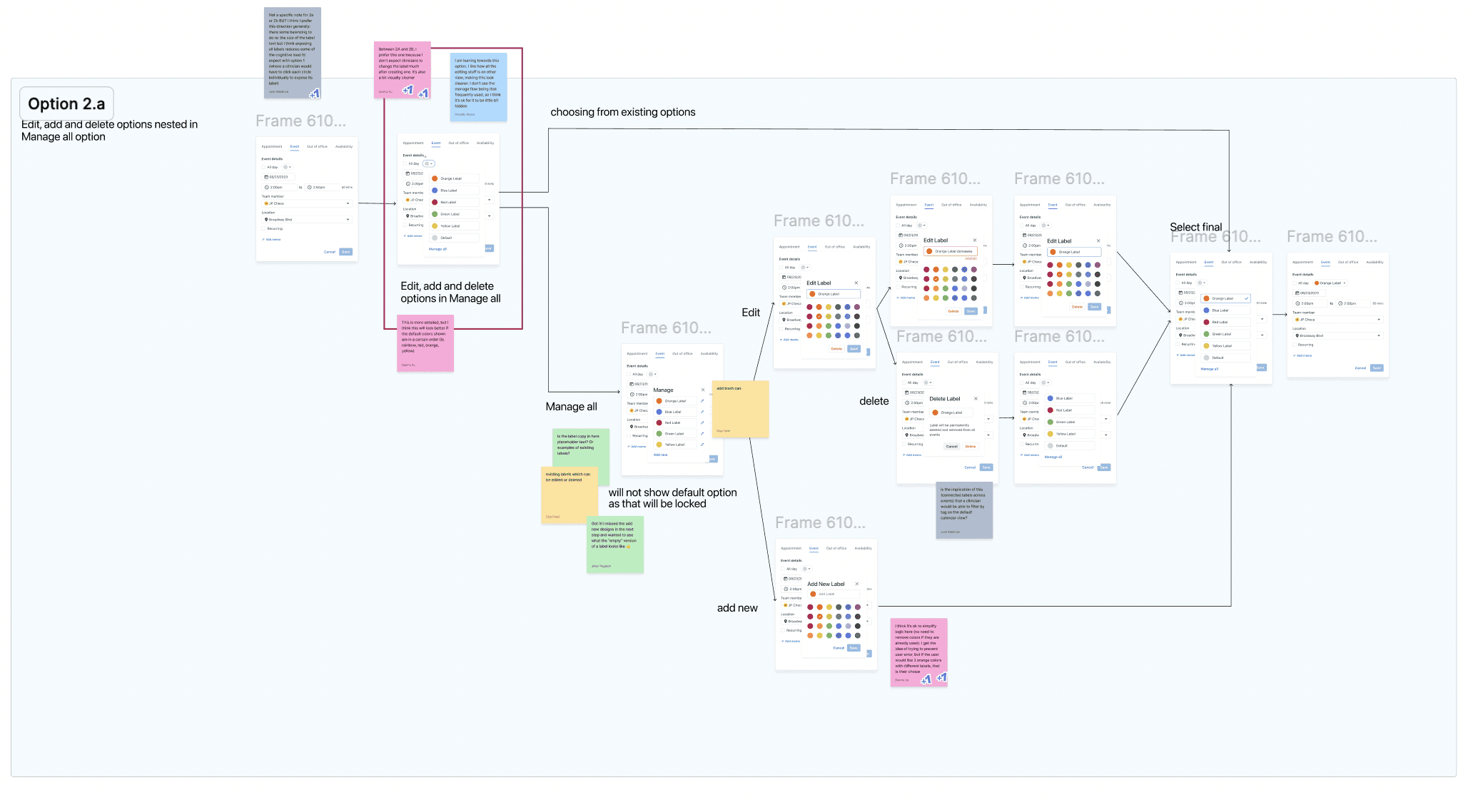
Ideation & exploration — Explored various approaches such as icons, labels, and color cues.
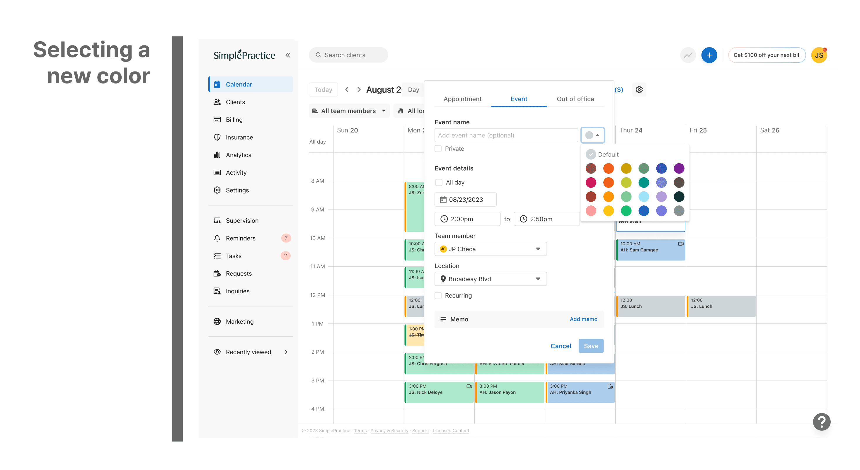
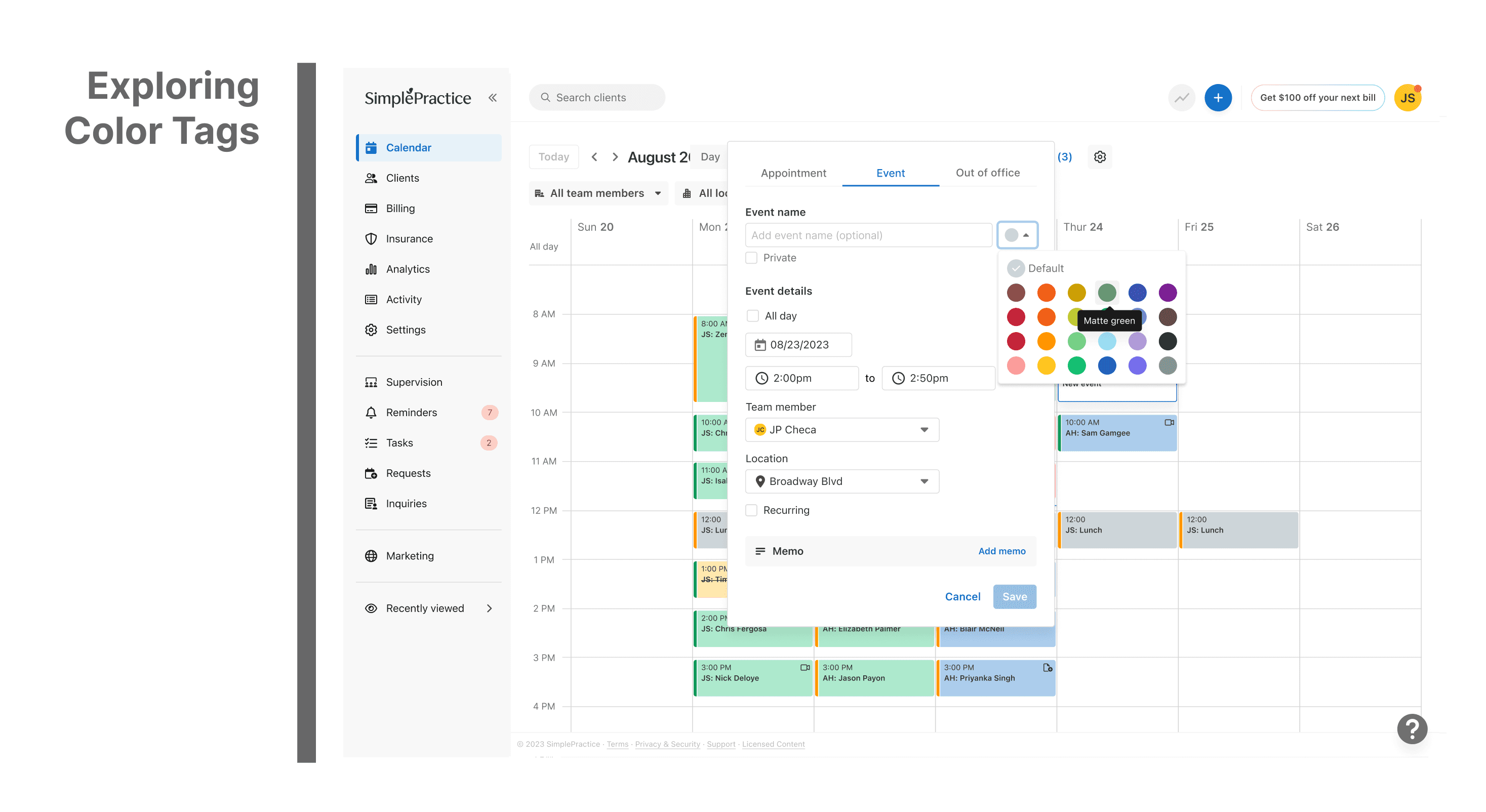
Solution direction — Chose custom color tagging as it offered flexibility while maintaining calendar cleanliness.
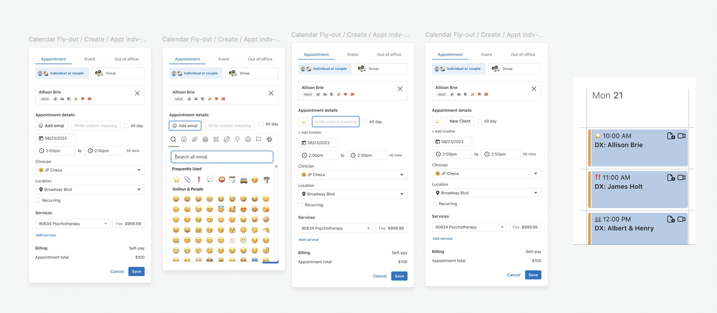
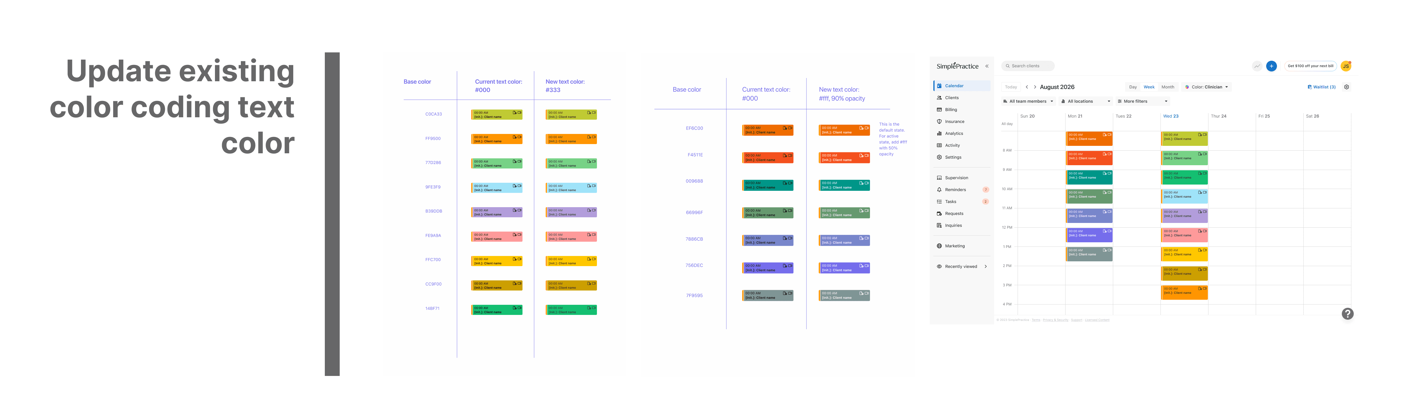
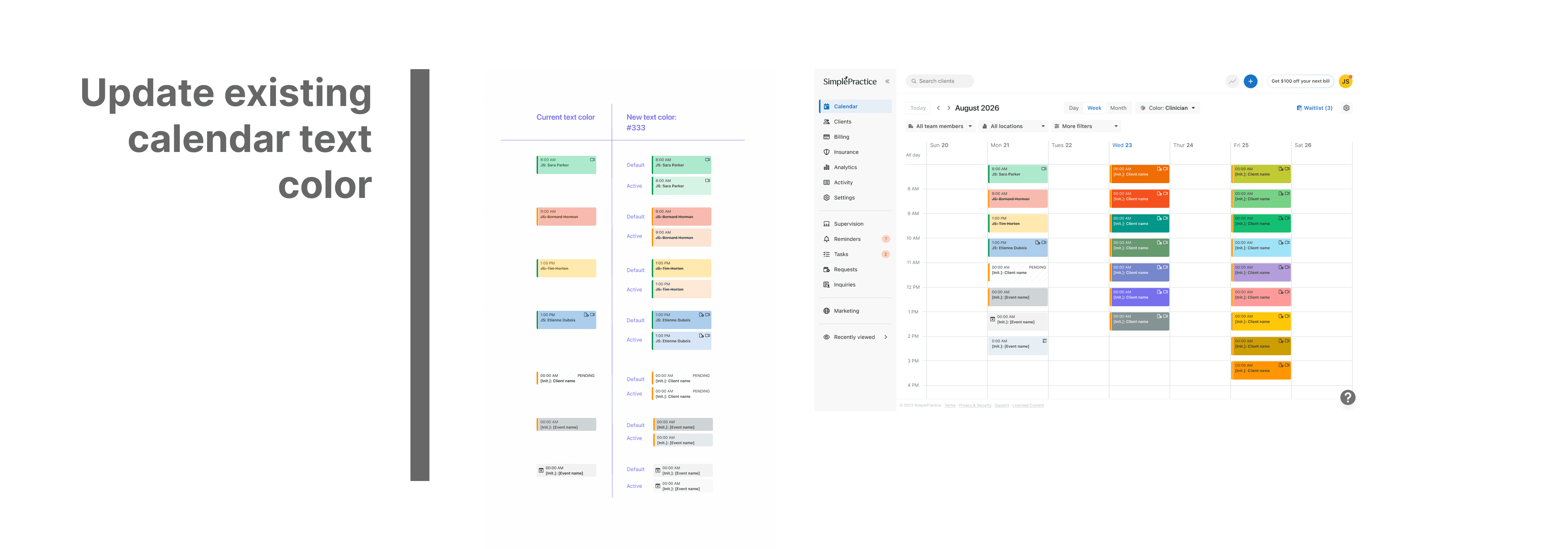
Design & iteration — Prototyped and tested color combinations to ensure accessibility and alignment with the brand palette.
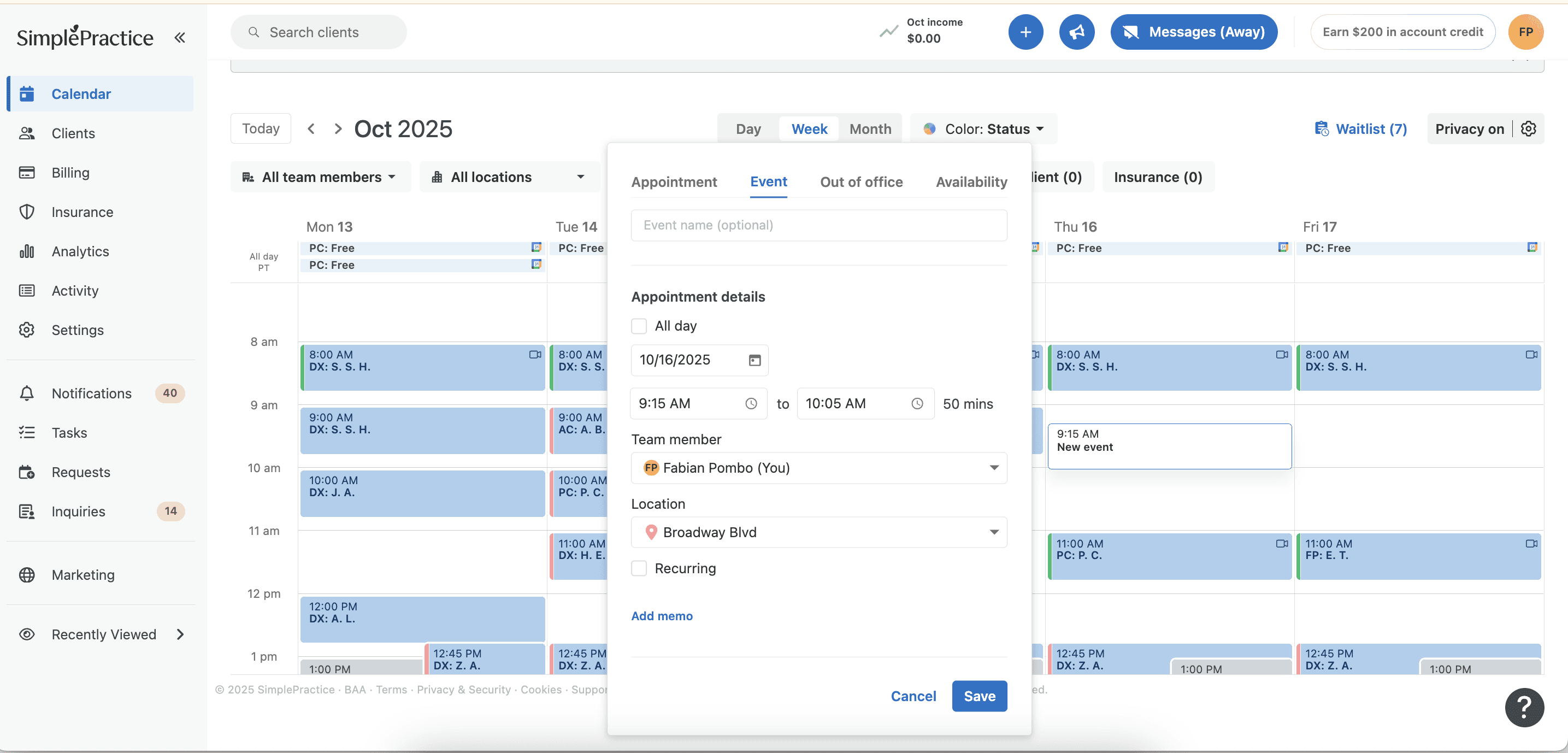
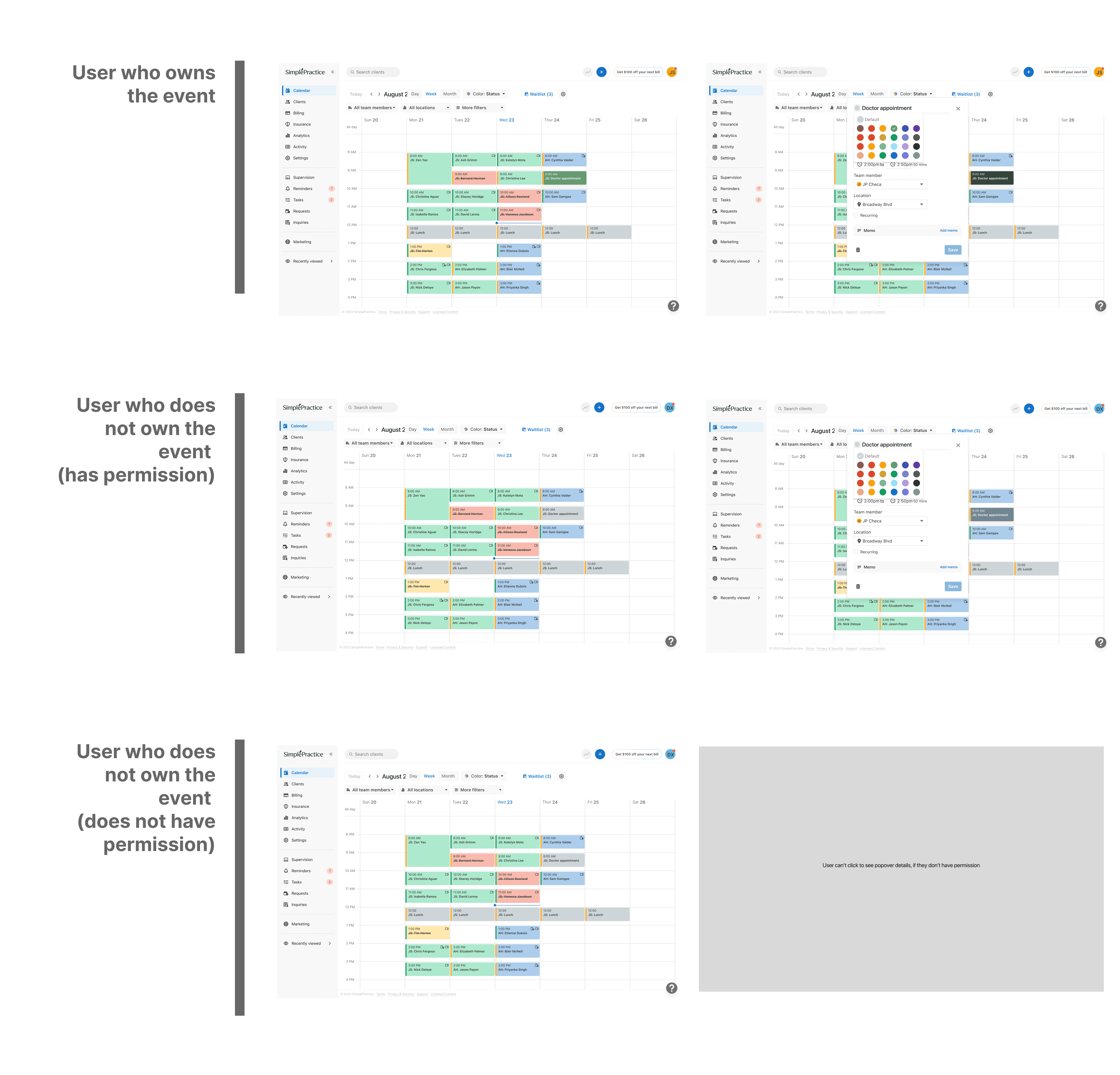
Developer handoff — Created scalable design tokens and documentation for consistent implementation.


Paul Ambas
Product Manager @SimplePractice
"I had the opportunity to work closely with Diya on the Calendar squad at SimplePractice where I led product and she owned design across several initiatives. As a PM, what stood out immediately was her strong product intuition- she consistently approached design problems with a clear understanding of user needs, product goals, and technical constraints. Diya has a rare ability to take ambiguous ideas and quickly translate them into thoughtful, intuitive experiences that help teams move forward with clarity. She was a fantastic partner to work with - proactive, highly collaborative with engineering, and always pushing the team toward better product decisions. Any product team would be fortunate to have Diya as a designer."

Dianna XU
Senior Product Designer @ SimplePractice
"I worked with Diya on the Calendar Squad at SimplePractice, where she quickly tackled end-to-end projects with the product team and adapted rapidly in an ambiguous environment. What stood out most was her openness to feedback and exploration, and her genuine thoughtfulness regarding the user experience during every iteration. I highly recommend Diya for her excellent dedication and growth mindset."
Continue Exploring

Case Study · SimplePractice
Rebranding Therapy Finder
A system-led redesign improving discovery for therapists and seekers.